Accenture: Using Data Visualizations to Support Decision-Making
Utilizing Tableau dashboards to visualize and track stakeholder sentiment

Role: Data Science Consultant
Industry: Chemicals & Pharmaceuticals
Responsibilities: Data Synthesis, Data Visualizations
Tools: Tableau, Excel
Timeline: 2 weeks (November 2023)
Summary
My team was enlisted to support our client in the exploration phase to implement a new ERP system to replace their outdated and limited software. With my team having come up with a recommendation, I documented stakeholder’s sentiment on our team’s recommendation weekly to see areas of concern we would need to address moving forward and ultimately get them on board.
The Challenge
Our client was a major competitor in the chemicals & pharmaceuticals who had an outdated Enterprise Resource Planning (ERP) system with limited functionality. As a result, they sought out my team from Accenture to conduct discovery on the software and provide a recommendation on the best software to replace their legacy system.
I joined the team after they had already come up with solution recommendation and was there to document weekly sentiment about how stakeholder’s felt about the recommendation based on a weekly survey.
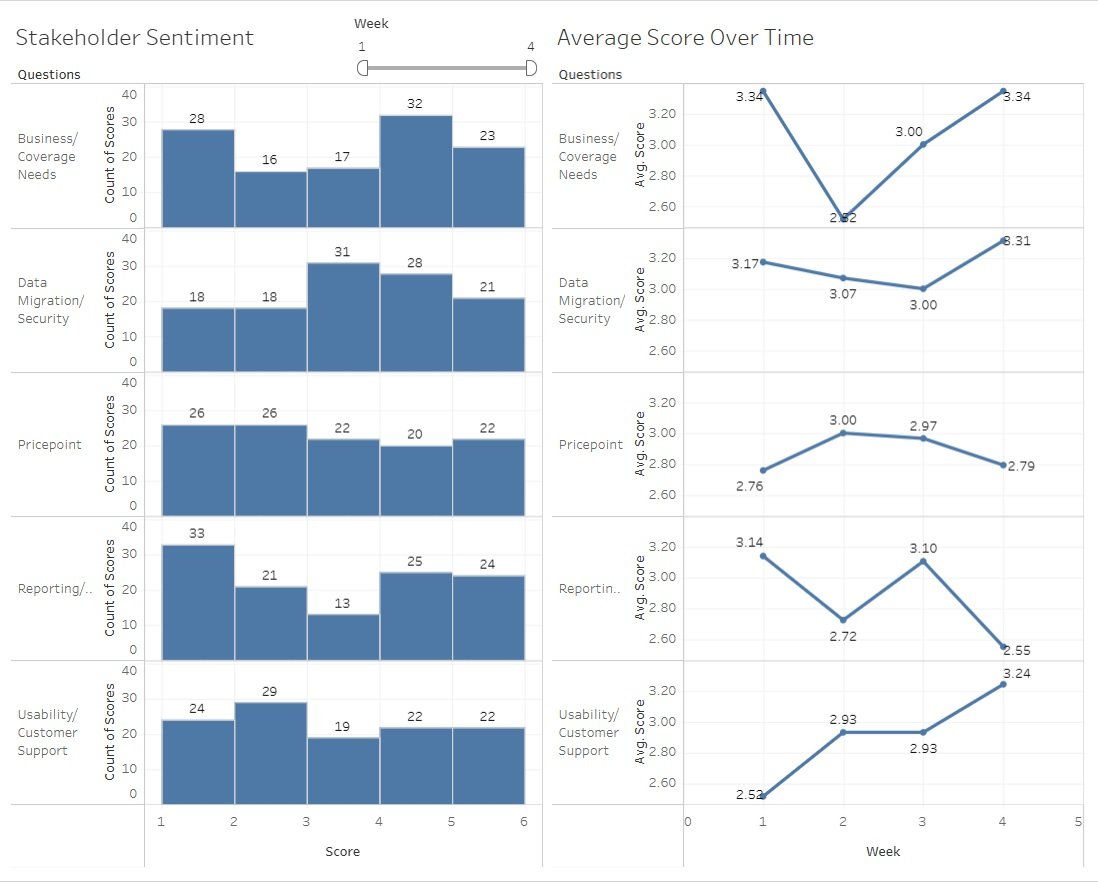
To visualize the data, I created a combination of table to show:
(1) Stakeholder Sentiment in 5 areas each week
(2) the Average Score stakeholder ranked in their confidence of the recommendation in each area
Visualizing the Data
Outcome
Due to our strategic approach, powered by the data visualizations, and the rapport we built with the client, they ultimately decided to move forward with our recommendation!
Learnings/ Reminders
How you display the data is crucial and can really make or break how easily it’s interpreted
Data is immensely powerful, if used appropriately
Next Steps
Moving forward, I rolled off the team and continued on another project but a fraction of the team moved forward with the client to continue the system implementation!
Note: Due to NDA reasons, I cannot reveal the client name or use actual client data. Rather, a dummy data set from Kaggle was used, with slight adjustments to ensure the column headings were in line with my project and the data visualizations were recreated on Tableau Cloud.